Júlia Váradi talked with Attila Auth, a senior lecturer at the Hungarian University of Fine Arts, founder of Auth Graphic Design Studio [Auth Design Grafikai Stúdió] and the designer of the Budapest Festival Orchestra’s beautiful logo.
Do you still remember how you were commissioned?
Yes, of course. The Budapest Festival Orchestra announced a competition around 2007 to create its profile and, particularly, design its logo. There were several entries, and eventually, after some tough going, the winner was selected. We were very glad that it was us.
What was there in the announcement? Did you have to consider some strict specifications?
On the contrary. It was a very free competition, which meant we could unleash our imagination. There were almost no restrictions.
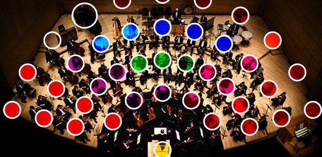
Where did the idea of the colored dots come from?
With an assignment like that, first you explore the task thoroughly and then study international examples created for similar purposes, i.e. the good and not so good ideas already realized by our competitors. And, of course, you check out the logos used before, which will most probably seem outdated, such as the violin key, stylized notes etc. And then comes getting to know the orchestra. Photos, videos, films about the concerts. Among these, I found several pictures taken from above where the semicircle of the orchestra was clearly perceptible as they were sitting around the conductor standing in the middle. I had the idea on one of these occasions that somehow the flow of music should be depicted as it emanates from this semicircle. As a graphic designer, I immediately understood that this could be represented in a drawing. The seating was obviously a given. And soon I also realized that in fact this was a colorful cavalcade with many different instruments and many different personalities, which could only be represented by a variety of colors. Then I thought that the seating could also be depicted by the size of the dots. For sure, I had to illustrate the kettledrummer in the top row with a bigger dot. And this bigger, grey dot gave the whole thing a certain rhythm, while the golden dot of the conductor also enhanced the image.
What was your earlier relationship with music and instruments like?
I used to play in a wind band, mainly classical arrangements from a variety of classical scores. So I had already had that kind of experience, and I had also been to concerts, although not very often. These memories came back immediately and they were very strong.
I remember that your entry was happily accepted, straight away and without any reservations. That must have been a great success.
Yes, we were very proud of it, and the new BFO logo soon became inherent to the visual representation of the orchestra.
Did you mind that later there were also some modified versions of it? Sometimes it is black and white, and the colored dots are used not only in the semicircle but also elsewhere.
The attitude of a designer is the same as if it was their own child. At first, he feels entitled to control the child’s care and upbringing and then, after a while, even if he would still like to keep that “cute little fluffy white dress” on her, she will want to get rid of it and have something new. That’s the time to let her go and take her own path. It is the same with the logo with the dots. The essence will remain, of course: the dots, the meaning everybody understands and the reference to the flow of music.
As I understand, the BFO’s logo is now included in an important textbook. What is it exactly?
This is a unique thing that has been missing in the past 15-20 years. The book is a collection of Hungarian logos with explanations. I was glad to see that several of my 100 or so logos appear in the volume including the Festival Orchestra’s logo with the dots.

Attila Auth